


Are you looking for ways to improve your landing pages to produce more conversions?With 55% of web activity occurring on smartphones and tablets, you’ll need to ensure they’re compatible with all kinds of mobile devices.But you may be wondering:Do I have to optimize every webpage and email for every device? Maybe. Maybe not. It all depends on where your best customers are spending their time online. In this post, we’ll show you how to use your form builder and Google Analytics to identify:
- How much of your web traffic is coming from mobile
- Which devices your best customers are using
- What this says about your mobile marketing campaigns
Start in Google Analytics by going to Audience>Mobile >Overview. You’ll get a report that looks like this:
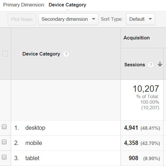
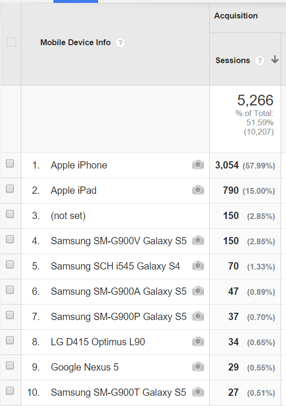
The report shows you exactly what percentage of website views are taking place on mobile screens versus desktop PC monitors. If you see a lot of traffic coming from smartphones or tablets, head over to Audience >Mobile >Devices. This will show you which specific devices your visitors are using:
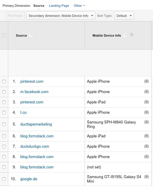
If you use UTM parameters to track emails and blog posts, you can also see what devices are being used to view those specifically. Go to Acquisition >All Traffic>Referrals and add a secondary dimension for mobile:
Now that you know which devices people are using to view your content, it’s time to find out for yourself what your visitors see. You can use a free tool like Responsa to test how your pages appear on different screen sizes. Some marketers will even make a trip to the local tech store to test them out in person. Ask questions such as:
- Is the content easy to read?
- Is the form easy to fill out?
- Is the call to action clear?
- Is important information clearly visible?
- Is this page attractive? Does it load quickly?
If you discover that your landing pages, blog posts, and emails are not rendering well on mobile, there are several steps you can take:
- Blog posts: Use concise subheads, bolding, bullets, and short paragraphs that are easy to skim on small screens.
- Landing pages: Use our guide to check for imagery, trust indicators, and other elements that can help drive mobile conversions.
- Emails: Skip the sidebars and opt instead for templates that are mobile-responsive, and keep your copy as short as possible.
- Web forms: Follow our mobile tips to ensure your forms are easy to fill out and submit on various devices.
Bottom line: When you know exactly which devices potential customers are using, you can make it easier for them to convert into leads for your business.
Interested in learning about Formstack's Google Analytics integration and other optimization features? Click here to sign up for a free trial.

