


Think of all the ways an online form submission could be a game changer for your business:
- The customer support question that turns a disappointing experience into word-of-mouth referrals
- A payment that turns out to be the first in a lifetime’s worth of purchases
- The partnership inquiry that has potential to get your brand in front of high-profile industry players...
...and on the list goes.With so much riding on your online forms, don’t you think it’s time to make them standout experiences?Even if you’ve A/B tested, shortened and adjusted form fields and buttons, conversion rates may be low if you fail to address other details that matter most to users. With a little bit of behind-the-scenes preparation, you can easily turn an underperforming form into your landing page’s greatest asset.Without further ado, let's take a look at three overlooked opportunities to optimize online forms for more submissions:
1. Try a different placement
What happens when you’ve tested your call to action, reduced the number of fields, adjusted for mobile...and a form still has low conversion rates?It’s probably not the form.Embedding an online form in the wrong location can dramatically influence how many visitors will notice it, be drawn to it, and stop to fill it out. For example, did you know that content in the sidebars of top-performing blogs is clicked less than 2% of the time? It’s not exactly an ideal place for a form.What’s the fix? Easy: try a different spot. Read our Where to Place Your Forms for Higher Conversions, where we looked at five high-converting website placements for online forms. Those are just a sampling of the many contenders for better form conversion rates throughout your website. Try placing a newsletter signup form in the body of your blog post, a trial offer at the end of your flipbook, or a lead generation form below an on-demand webinar.
2. Fill it out yourself
When was the last time you filled out your own landing page form? If it’s been awhile, you may have no idea what the user experience is really like.Here’s why this is a big deal:In this study, Google found that a growing number of Internet users are going online primarily to pursue passions. Compared with others who seek entertainment, these people are 70% more likely to make purchases and 42% more inclined to commit to a brand that engages them on their interests.How do you think they’re going to make those connections with your brand? Yep—through your landing page forms. When that entryway doesn’t meet their expectations, you’re essentially closing a big window of opportunity.There is an easy fix:Fill out your own online forms in Chrome. Submit them using Safari. See how they look to the Android user, the iPad owner, the butcher, the baker, and the candlestick maker. We guarantee you’ll find at least one change that’ll make the experience better.

Quick tip: Don’t have time to view every online form on every device? Use this trick in Google Analytics: Go to Audience > Mobile > Devices to get a top-ten list of the devices your audience is using. Then use this highly sophisticated method to get your hands on those same gadgets: ask to borrow one, or stop by your local electronics store.
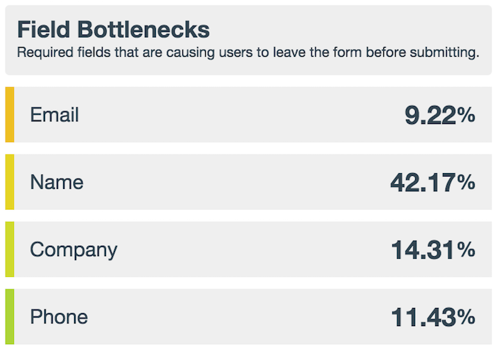
3. Pinpoint the bottlenecks
How many times have you personally abandoned a shopping cart or online form out of sheer frustration? The next time this happens, note what it was that made you change your mind. Make it an actual note you can refer back to later, whether it’s a “form goofs” notebook in Evernote or “form fixes” channel in Slack. Then, when you’re building a new web form you can revisit the list and ensure you’re not inadvertently doing the same things with your forms.Formstack Platinum users have a built-in “notebook” in the form of Bottlenecks and Partial Submissions. Bottlenecks let you see which fields stop users from completing and submitting a form. Partial Submissions allow you to collect information from users who started to fill out a form but didn’t complete it.Both features make it easy to see what causes people to stop short of completing a form so you can find and fix problem fields.
The simple truth is this:Most people won’t tell you when they don’t like your form. They’ll simply abandon ship and move on to smoother seas. The three methods outlined above are insanely easy to use and can give a big boost to form conversion rates.Do you want even more ways to optimize your online forms for conversions?
Our Form Conversion Report is packed with many more actionable ideas—download it now at the link below.

