


In Formstack’s popular Form Conversion Report, we covered how factors like length, timing and industry can impact response rates.
Did you know color impacts conversions, too? When Performable changed the color of its CTA button, it saw a conversion rate increase of 21%! Thankfully, you don’t have to go to graphic design school or get a degree in psychology to learn how to maximize form conversions using the psychology of color.
Five best practices on color theory
If you're looking for ways to boost form and survey conversions, try utilizing these best practices in your form design. Playing with color could possibly yield some amazing results, all you need to do is test to figure out what works best for your brand and audience.
1. Use color to improve user experience.
People struggle to read blue text on a purple background. One the other hand, white font on a colorful button will keep calls to action legible and make them pop.
2. Use color to influence emotions.
Red can draw attention to one aspect of your landing page (like the form). Use blue to create a sense of security or black to convey a cutting-edge offering. Similarly, if you’re targeting women stick to soft shades of blues and greens. For men, go bold, but stay away from brown, orange, and purple. (Seriously. It’s backed by science.)
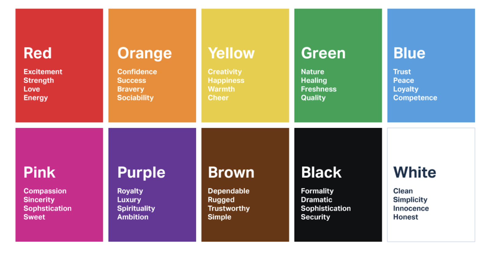
This chart created by UserTesting gives an example of color psychology by displaying the common emotions and themes associated with various colors.
3. Use color to elicit a response.
Ever notice that most “submit” buttons are orange? It’s not a coincidence. Orange combines the energy of red and happiness of yellow. In other words, it’s an attention-grabber.
Green, on the other hand, has a calming influence and is often used to ease buyers and make them more comfortable with purchasing decisions.
4. Use color to highlight the important stuff.
Most people won’t read your web copy. They’ll scan it. Encourage visitors to fill out your form by using color to highlight value propositions, testimonials, calls to action, and other elements of the perfect landing page. Of course, you’ll want to customize colors in your forms to match your brand identity as well.
5. Always test.
Not sure which colors will have the most impact on your audience? The most successful companies continually try on different designs, fonts and, yes, color combinations. Change just one thing at a time to see what responses different colored backgrounds, headlines and buttons get.
Pro Tools and Tips to Enhance Your Form Colors
Making some simple color updates to your forms can really make an impact. Use these tools, tips, and resources to make smart color decisions for your forms. From choosing a color palette to understanding how colors affect purchases, check out these resources to dig even deeper into color theory and the psychology of color.
Adobe Kuler
Find a photo that provokes the emotions you want your users to experience. Then, upload it to Adobe Kuler for an instant color palette.
How Colors Affect Purchases
This handy infographic from Neil Patel can help you see at a glance which colors will work best for your target audience.
Making smart color choices is just the start of how to improve form conversions. Contact us to learn more about our forms product.
