


Whether you are using an online form builder like Formstack or you build your own online forms, there are some easy things that you can test to see what converts better. Below are three easy things that you can test on your online forms to test for better conversions.
Test #1: Linking vs Embedding
There are sometimes when linking to a hosted online form is inevitable, if you don't have access to your website or it is hard to make changes you may just need to link to a form that does not reside on your website. If you do have access to your site or CMS (Content Management System) try testing out what works better, embedding your form on your website or linking to a form.
Why this is a good test: This is a good test because trust is a key element in any online relationship. Whether it is a simple online survey or someone is purchasing something via an online order form they want to know that they information they give you is safe. Someone seeing a third-party link i.e. https://www.formstack.com/forms/123 vs seeing a form that is nicely embedded on your website can make all the difference. While the form embedded on your site is still hosted by a third-party (if using an online form builder) it looks and acts like it resides on your page, has your branding, and takes on the look and feel of your website. Online relationships, especially new ones are tenuous, do everything you can to make your customer or prospective customer feel like their information is safe, secure, and private.
Test #2: Length of your form
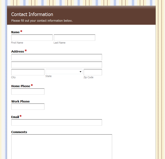
It probably seems obvious that a more compact form is better but it is surprising how many people who contact our support have really long forms. Usually the culprit is online contact forms or lead generation forms. Usually the thought is the more information we can collect the better. So people start down the path of "we definitely need a potential customers first and last name because that's what Highrise has in their lead fields, we definitely need an email address...and we should probably have their mailing address in case we want to send them something, and we want to see what industry they are in"...and on and on
Why this is a good test: When you start adding features, software developers often call it "feature creep". When feature creep sets in, the product gets more cumbersome and more difficult to use. Avoid feature creep in your forms. Take the questions you want to ask in an online lead generation form and cut them in half...see how many more leads you get. Testing the length of your form allows you to see just how much information your users are willing to give you. If it's a lead generation form think of it as dating. You don't want to scare your date by over-sharing every little detail of your life, you want to hold some things back. Same with prospects to your site. Gather enough information to start a dialog, you'll have reason to go back to them and they won't feel like they just shared the world with you.
Test #3: Submit Button
We were on a call one day when the person said he really liked that you could edit the submit button in our online form builder. He said that "Submit" sounded so passive and un-exciting. When you think about it, no one really like to "submit" to anything or anyone...or at least not usually. Testing out different calls to action for the submit button is an easy way to see what words trigger a completion of your forms. Try some action words like "Sign Up Now" or "Register Today" or even "Join Us". Sure, a good submit is worthless if you have an ugly form, but the right words and the right inspiration could have people clicking their way through your form and creating better responses.


Why this is a good test: Different words provoke different actions in people. We did a test on our site with our Call to Action buttons site-wide, and the button we presumed would be the winner was not. Some buttons worked better on some pages vs other pages. Even though the site was the same, each page had a little different result. Often your presumption of what will work vs what does work are very different. Testing is the only way to know.
An easy way to run this test is to duplicate a form and test two different submit buttons on each form. If you are sending a survey, try sending form A to half of your list and form B to the other half, see which converts better. Testing your online forms doesn't have to be difficult, it just takes a little bit of time and thought. In an online world where the smallest thing can be the difference between a user completing your form or jumping to another website, it just makes too much sense not to test your online forms to make sure you capture the right information at the right time!
Learn More: For more tips on A/B testing, check out the guide here.

