


Freelance designer Bart Fish understands the importance of mobile-friendly forms. Here are some of his expert tips on optimizing your forms for a mobile audience:
Online forms are like doors: they’re ubiquitous, vary in their ease of use, and provide entry to the places you want to go or things you want to buy. Like doors, it’s critical that forms take into account where they are being used, by whom, and for what purpose. The best forms attempt to limit the amount of friction for users—just as the best doors are most often the ones you don’t notice.For mobile forms in particular, an effortless design is critical—otherwise, today’s users have plenty of other doors to enter (i.e., your competitors).

If you take a desktop approach to a mobile form, whether it’s a lead generation form, login, or e-commerce checkout, your users are going to be frustrated. How are mobile forms different than desktop versions? Obviously, they have smaller screens, but they’re also touch-based and typically filled out on the go. Plus, the amount of effort users are willing to put in is much lower. I’m going to share several key elements of form design and how they should be architected to increase mobile conversions and produce a better mobile user experience. As you’re reading, if any of these points sound like best practices for desktop forms as well, they probably are.
Critical Elements of Mobile Form Design
1) Number of Fields: One of the most common issues I see regularly is a company’s desire to get ALL the information they could dream of wanting from a user. When pressed, they'll often say, “We need all these fields for our marketing and sales teams. No, we can’t get rid of any of them; they are all important.” What these companies are missing is that they are essentially sacrificing their conversion rate and mobile user experience for unnecessary information—a simple review of their field bottlenecks would certainly reveal this to be the case. But surprisingly, decreasing the number of fields on a form has greater implications than just conversion rates. The number of fields you have on your mobile forms will also impact the user’s perception of your brand. It’s easy to see how cumbersome a 10–12 field form would feel on a mobile device. Not to mention that we live in a time where there is increased awareness around the security and use of personal data—the more information a company wants, the more uncomfortable users can feel giving it. If there is truly no way to make your 20-field form any shorter, you should consider a multi-step form. Especially on mobile, this can help chunk out the information into manageable amounts, while giving users the feeling that they are making progress. If you use this strategy, it’s important to give indicators of progress, use microcopy effectively, and keep the steps to a minimum.
2) Field Order and Field Inclusion: How you order fields can make a big difference in scannability and can affect the user’s perception of how difficult the form is to complete. Fields should be organized according to the user’s perspective, not the marketing software or the demands of the sales or marketing team. Based on current form best practices, it would be odd to ask for a phone number before a name, for instance. It’s also worth considering whether you need certain information (like a phone number) at all, especially when your form is focused on converting users at an early stage in their customer journey. When mobile users see fields that seem unrelated or unnecessary, they’re likely going to second guess whether they are committed to providing their information.
3) Input Fields: The number one issue I come across regarding input fields is forms that don’t use the entire viewport of the device. The input fields either aren’t full-width, aren’t tall enough, or are just difficult to tap.
If a user has to pinch and zoom to use your form, you’ve failed.
Generally, this is due to extraneous design elements or generous padding. The form should be the main focus, and its usability depends on how easy it is to read, tap, and input information. Making sure the keyboard matches required text inputs can reduce friction as well. If a field is asking for credit card information or number-based data, users should be given the numerical keyboard to input their information. Sure, they could navigate to the keyboard, but why create more friction? Leveraging geolocation can also provide a better user experience. This functionality is built in to most devices, so why force users to input four or five additional fields if they don’t have to? Lastly, avoid dropdowns wherever possible. Instead, provide easily tappable solutions. LukeW (a well-known digital product leader and designer) shows a good example of how providing tappable solutions can decrease friction.
4) Field Labels: While a seemingly small detail, field labels do a lot of heavy lifting when it comes to helping users understand what information is being asked. There has been a good deal of research around whether left-aligned, right-aligned, or top-aligned labels work best. Most experts agree that top-aligned labels are the most effective and the easiest to scan. When discussing mobile field labels specifically, inline field labels are also common. Many designers gravitate toward this style because a) it looks nice, and b) it saves critical space. The main problem with this design pattern is that users can forget what information is being asked as soon as they start typing. For that reason, inline field labels are often cited as a poor design decision that results in usability issues. The good news is that there is a solution for this issue, and it is increasingly becoming a new standard for mobile forms: the float label pattern. With this pattern, a user starts typing in an input field, and the field label doesn’t disappear—it animates to a smaller scale, often above the field. This way, the user always has some indication of what information should be typed into the field. The length of your field labels also matters. While we often talk about forms as a conversation, using field labels that are more conversational can create additional friction. Imagine these two scenarios:
- Person 1 comes across a door that has some instructions. “Please exit using this door.”
- Person 2 comes across a different door. This time, there is simply an arrow pointing to indicate the exit.
Comparing both situations, which person do you think will likely take action quicker?

There’s nothing wrong with providing context (our objective is not to confuse our users), but most of us are used to seeing field names like this: Name, Email, Address. You would unnecessarily complicate the conversation and create additional friction if you were instead to use labels like these: What is your name?, What email can we reach you at?, Where do you live?.
When dealing with forms, every microsecond makes a difference in the user’s perception of the form’s difficulty.
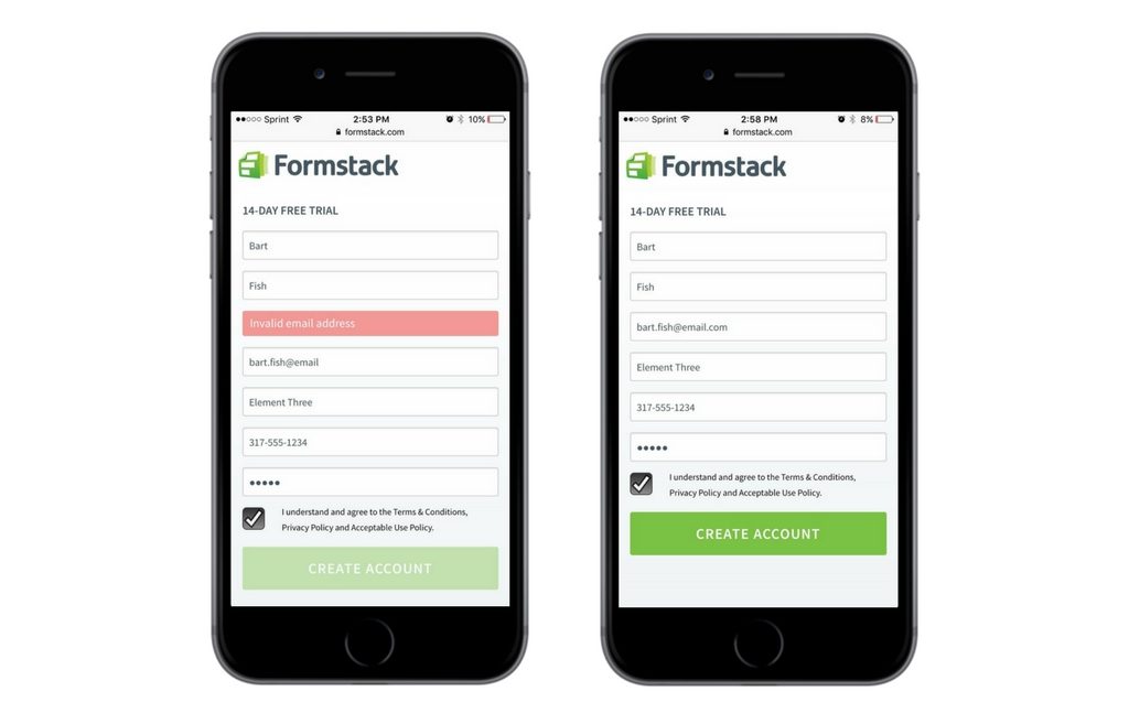
5) Feedback and CTA Buttons: Have you ever filled out a form and clicked submit…and nothing happened? Or the screen went blank? Or you received an error message with no indication of which field was the error? In those situations, it’s natural for users to feel confused or to inappropriately assume their information was successfully transmitted. I mentioned earlier the importance of making sure form elements are tappable, and this applies to CTA buttons as well. On mobile forms, it’s important that your CTA buttons are clearly clickable, have labels that logically match what you’re asking the user to do, and can be easily located. Buttons that are not the recommended tappable size (44px by 44px) and lack feedback (e.g., “Success! Your form has been submitted.”) will cause users to question whether they’ve successfully completed the form, which makes them far less likely to fill out another form on your site in the future. I know these seem like simple requirements (and they are), but unfortunately, they are overlooked far too often. Giving users continuous feedback and a clear path to submit their forms helps to keep them moving forward.
Reducing Friction in the Mobile User Experience
If you take nothing else away from this post, remember that forms, like doors, are gateways to something bigger and better for you and your user. If the design of your forms is negatively impacting your mobile user experience, you’re only doing a disservice to yourself and your users. Remove or reduce that friction, and you’ll be surprised at just how much your conversion rates will grow.
About the Author

Bart Fish is a freelance designer who leverages his cross-discipline experience to create strategic brand-focused solutions for his clients. Taking a business-oriented and customer-centric approach to design, Bart’s passion for improving user experience and optimizing for results make him the creator everyone wants on his team.
Learn how you can manage your forms on the go with Formstack's mobile app down below!

