


For proven landing page tips, sign up for tomorrow's webinar, "The Anatomy of the Perfect Landing Page." Gain practical insights from Doug Karr, founder of The Marketing Technology Blog, and Jeff Blettner, Formstack's conversion optimization specialist. We're crushing all our registration records, so make sure to reserve your spot!
Learning to put together a high-converting landing page is no easy feat. Subtle changes in design, layout, or copy could mean the difference between coveted clicks or the dreaded “back” button.
You may have already seen our Anatomy of the Perfect Landing Page infographic, but sometimes what you really need are examples of best practices in action. So we're taking our infographic a step further and pulling together a list of really awesome landing pages. These ten great examples each showcase one of the ten key elements of landing pages that convert.
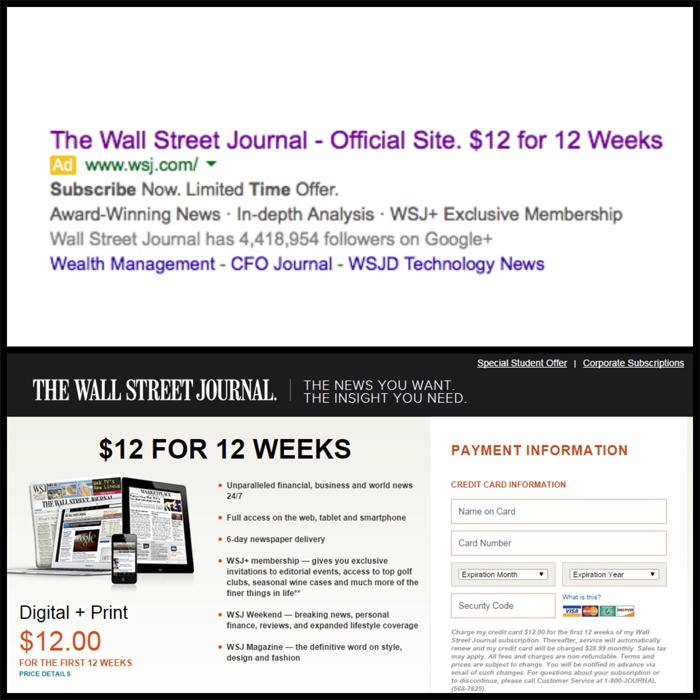
1. Wall Street Journal: Primary Headline Matches Ad Copy
People can discover your page from other sources, such as a paid search ad or a link in a marketing email. Your landing page must match your ad copy.
If you’re offering a special deal, make sure it’s front and center when someone clicks over to check it out. The Wall Street Journal demonstrates this practice when targeting new subscribers with a “12 for 12” deal.
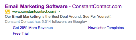
2. Constant Contact: Clear, Concise Supporting Headlines
When it comes to matching ad copy, Constant Contact gets it right–in all headlines. Note how SeeFor Yourself in the ad matches the big blue “Create My Account” button and “Start your FREE email campaign today” headline on the landing page.
Click on the Pricing navigation button and you learn exactly what’s meant by The Best Deal Around: an oversized, bright yellow “$15” headline shows just how low monthly prices can go.All content is laser-focused on proving value and showing how easy it is to get started…as promised in the corresponding advertisement.
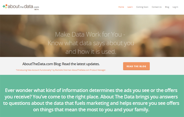
3. Axciom: Impeccable Grammar
All landing pages we’ve selected for this post use proper grammar. We especially like Axciom’s About The Data landing page. It takes a highly complex, technical topic and translates it into consumer-friendly language. The copy is free of jargon, typos, or credibility-busting spelling mistakes.
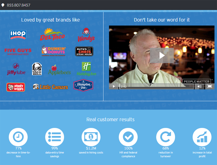
4. People Matter: Strong Testimonials
This landing page from People Matter, a workforce automation software service, includes a simple, easy-to-complete form. What really makes it a powerful selling tool are all the third-party endorsements: recognizable client logos, a video of compelling testimonials, and real customer results.
5. Netflix: Convincing Call to Action
After a visitor reads your compelling headlines, it's crucial they know what to do next. Enter the descriptive, attention-grabbing call to action button.
Netflix does this really well with a big, blue, impossible-to-miss button that invites new visitors to “Start Your Free Month.” Your primary call to action—whether in a headline, button, or link—should be compelling and give very specific instructions.

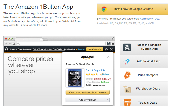
6. Amazon 1Button: Clickable Buttons
Most people skim landing page copy. This is why it’s so important for buttons to be big and bright and to appear above the fold. Visitors shouldn't have to scroll to find them.
Amazon’s 1Button “Download Now” button is not only bright orange and oversized, but perfectly positioned in the top right. It’s hard to resist!
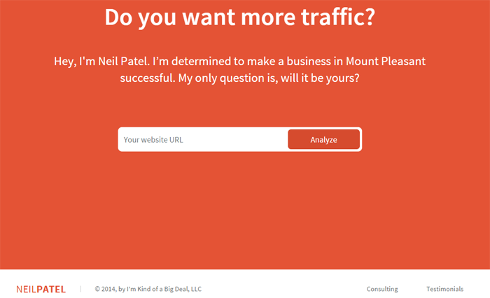
7. Neil Patel: Distraction-Free Navigation
For a landing page to convert, simplicity is key. And it doesn’t get much simpler than the homepage of digital marketer Neil Patel.
This super-clean webpage has just two links at the bottom right: one for consulting and another for testimonials. Keeping links to a minimum will ensure visitors aren’t distracted from your call to action.
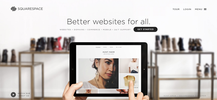
8. SquareSpace: Good Use of Visuals
Appealing images, graphics and videos can all give products and services an extra push. SquareSpace’s entire homepage makes use of this best practice.A single headline, “Better websites for all,” remains static as background imagery scrolls to show, rather than tell, the beautiful websites anyone can build.
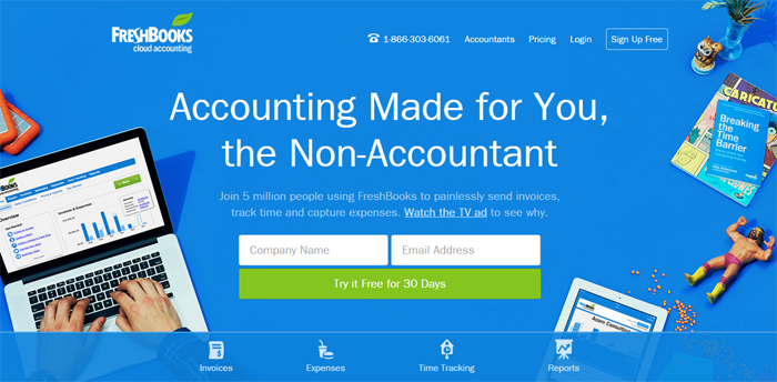
9. Freshbooks: Keeping Important Info Above-the-Fold
Freshbooks is a stellar example of keeping important info above the fold. They maximize the space with compelling headlines, strong visuals, and an easy-to-complete form with clickable button.
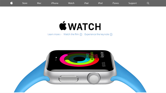
10. Apple: Always Test
Ever notice how often Apple’s webpages change? This is because Apple, a “king” when it comes to conversions, treats every webpage as a landing page to be tested and improved.
The highest-converting landing pages are those that are constantly evolving as its creators figure out which copy, images, calls-to-action, and other elements resonate most with users.
Want more tips on creating high-converting landing pages? Check out the blog below where we discuss how to optimize your landing pages.
